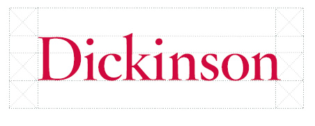
The core of the Dickinson graphic-identity system is a distinctive treatment of the college name. Through repeated application of this wordmark, Dickinson builds loyalty and awareness among its various audiences. Failure to use this wordmark, or using distortions of it, will diminish the identity system’s effectiveness.

Downloads
- White Wordmark (EPS)
- Red Wordmark (EPS)
- Black Wordmark (EPS)
- Red Wordmark–web (JPEG)
- Red Wordmark–web (PNG)
- Red Wordmark (JPEG)
- Black Wordmark (JPEG)
- White Wordmark (PNG)
Clear Space
The visual character of the Dickinson identity depends on clean, spacious and elegant layouts. Always use the recommended clear space, as shown below, to maintain optimum legibility and avoid interference from nearby text, complex illustrations or other elements that might compromise the wordmark’s impact.
Generous clear space and consistent placement are essential for maintaining the integrity of the identity.
The clear space is measured by the height of the lowercase letters (x-height) in the wordmark, as indicated in the diagram below. The minimum clear space must always be at least the width and height of one “x” on all sides of the wordmark. No typography or design element may be placed within this area.
Minimum Size
The minimum height of the wordmark is .25 inches for print usage or 25 pixels for electronic media.
Incorrect Usage
The Dickinson wordmark should be rendered with consistency. It should never be tweaked, stretched or otherwise manipulated. It should never be shown at an angle or filled with pattern, texture or photographic imagery.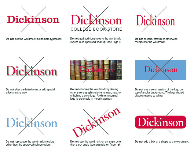
Additional Resources
- Design Services (project request forms and FAQs)
- College Seal (usage guidelines and downloadable files)
- Graphic-Identity Guidelines
If you require assistance with wordmark usage or in designing collateral targeting external, off-campus audiences, please contact design@dickinson.edu.